
System Settings for Ubuntu Phone

Matthew Paul Thomas
on 16 May 2013
Tags: app design , Design
In late 2008, I sketched initial designs for what became Gnome’s System Settings utility. This centralized most operating system settings in a single window, without the need to reopen menus or switch between multiple windows if you didn’t find the setting you were looking for the first time. It made Ubuntu, and other Gnome-based systems, much easier to configure.
Five years later, we’re building a phone operating system. So once again, we need a centralized system settings interface.
What other phone OSes do
The first step in designing this was a competitor evaluation of how other phone systems present system settings.

iOS 6.1.4.
iOS is highly consistent in using a hierarchy of list items for Settings. But their design is rather awkward in three ways. First, the top-level Settings screen is very long, usually containing 30 or more top-level categories. Second, Apple originally tried to include application-specific settings inside the system-wide Settings, which made them hard to find while using the app. Some apps (including nearly all the default ones) still do that, but nowadays most put settings in their own UI. And third, the top-level “General” settings category is a bit of a junk drawer — containing subcategories for everything from auto-lock to accessibility, software updates to Siri.
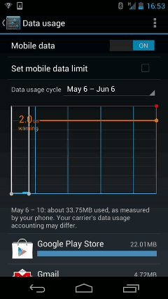
Android 4.2: Tapping “Set mobile data limit” checks the checkbox. Tapping “Mobile data” flashes the switch label, but does nothing else. Tapping “⋮” opens a menu of more settings.
Android’s Settings similarly uses a hierarchy of lists, though some sections use dialogs instead. It has other consistency problems, too. Sometimes checkboxes are on the left, sometimes on the right. Tapping a checkbox label toggles the checkbox, but tapping a switch label doesn’t toggle the switch — sometimes it navigates to a different screen, other times it does nothing at all. Sometimes a screen’s heading contains a Back button, sometimes it doesn’t. Sometimes it contains a “⋮” dropdown menu of more settings, and sometimes it doesn’t. All this shows the importance of system settings having, if not a single designer, at least strong design guidelines.
An impressive aspect of Android’s Settings is that they can display in either portrait or landscape mode.
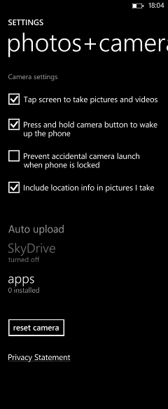
Windows Phone 8.
The Windows Phone design emphasizes typography and visual simplicity. It’s a bit rough around the edges: for example, the “photos+camera” settings screen uses ten font variations, and the main heading doesn’t fit on the screen. Windows Phone also groups “system” and “applications” settings on separate screens, but the separation needs work: for example, the voicemail sound effect is set in one of the “system” screens, while the voicemail number is set in one of the “applications” screens.
A nice detail in Windows Phone’s Settings is the use of summary values. The row you would tap, to navigate to a settings screen, often contains a line of small text summarizing the current settings values. This can save you from having to visit the other screen at all.
Learning from others
This competitor evaluation revealed three main issues. First, the difficulty of organizing system settings versus application settings. Apple tried to group them all together in iOS, but that lacks in-app discoverability. Microsoft used “system” and “applications” categories in Windows Phone, but suffers from poor sorting. It seems more likely that we can solve the sorting problem than the discoverability problem. So, as with Ubuntu for PC, Ubuntu Phone will have “System Settings”, not just “Settings”. Applications will be responsible for presenting their own settings.
Second, there is a tension between categorizing settings, and promoting frequent or urgently used settings. Categorizing by itself is tricky enough: different people might look for the same setting in different places. (For example, iOS sometimes mirrors subcategories of settings inside multiple categories.) A search function may help, but is not a complete answer, because people still need to know what settings are available in the first place. Categorization becomes even trickier when trying to provide quick access to settings like flight mode or orientation lock. Indicators at the top of the screen may help with this, by providing quick access to frequently used functions, like they do on Ubuntu for PC.
Third, it can be useful to reveal current state of settings as part of the navigation to those settings. This is usually done in text, with summary values, but an icon could work too. For example, a Bluetooth settings icon might be dull when Bluetooth is off, bright when it is on, and have an emblem when it is paired to any device.
User journeys
Two user journeys influenced the design of the System Settings interface.
The primary journey is someone wanting to solve a problem. Maybe their Internet connection is not working. Maybe they’re wondering if they can save battery. Maybe a cabin attendant has asked them to put the phone into flight mode. Maybe a friend has been messing around with their phone and they want to stop it from happening again. This person usually will be in a hurry, and sometimes irritated. They’ll want to get in and out as quickly as possible.
The secondary journey is an adventurous new owner, starting out with their phone, wanting to explore what it is capable of. They have more time to read explanations, and to explore cross-references between categories.
Designing the overview
Next, I sketched out nine possible layouts for the overview screen — the first thing people would see when they entered System Settings.


Selecting the most promising elements from each of the nine layouts, I passed them on to one of our visual designers, Rosie Zhu. She produced mockups of three possibilities, and with help from Marcus Haslam we decided on one final layout.


The design promotes frequently- and urgently-needed settings at the top, categorizes other settings compactly, and places bureaucratic stuff (“About This Phone” and “Reset Phone”) right at the bottom.
This is far from a final mockup. We need to finalize the icon style, and fine-tune control sizes, use of color, use of lines, and so on. But the basic layout is in place for engineers to start work. (Contact Sebastien Bacher if you’d like to help out with the code.)
Designing individual screens
Meanwhile, I have been busy designing individual settings screens. This has helped reveal missing controls in the UI toolkit, so they can be implemented for app developers to use them too.

Links to designs for the individual screens, as well as the design for the overview screen, are on the System Settings wiki page. Your feedback on any of the designs is welcome, either here, or on the ubuntu-phone@ mailing list.
Talk to us today
Interested in running Ubuntu in your organisation?
Newsletter signup
Related posts
Canonical’s recipe for High Performance Computing
In essence, High Performance Computing (HPC) is quite simple. Speed and scale. In practice, the concept is quite complex and hard to achieve. It is not...
Web team – hack week 2023
Today, around 96% of software projects utilize open source in some way. The web team here at Canonical is passionate about Open source. We lead with an...
Vanilla 4.0 release
Last week we released a new major version of the Vanilla framework. Vanilla 4.0 introduces the elements of the new style used for a current rebranding of...